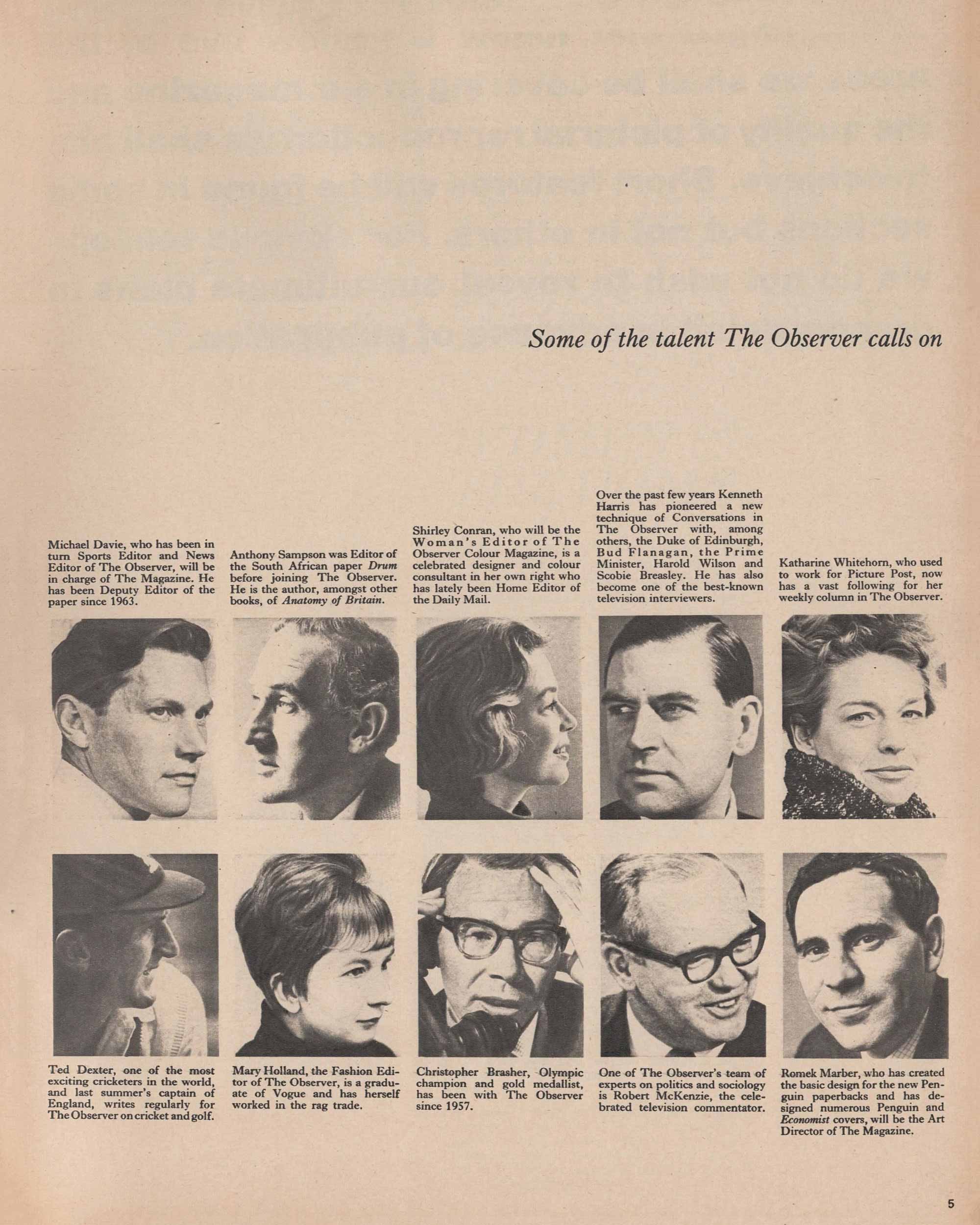
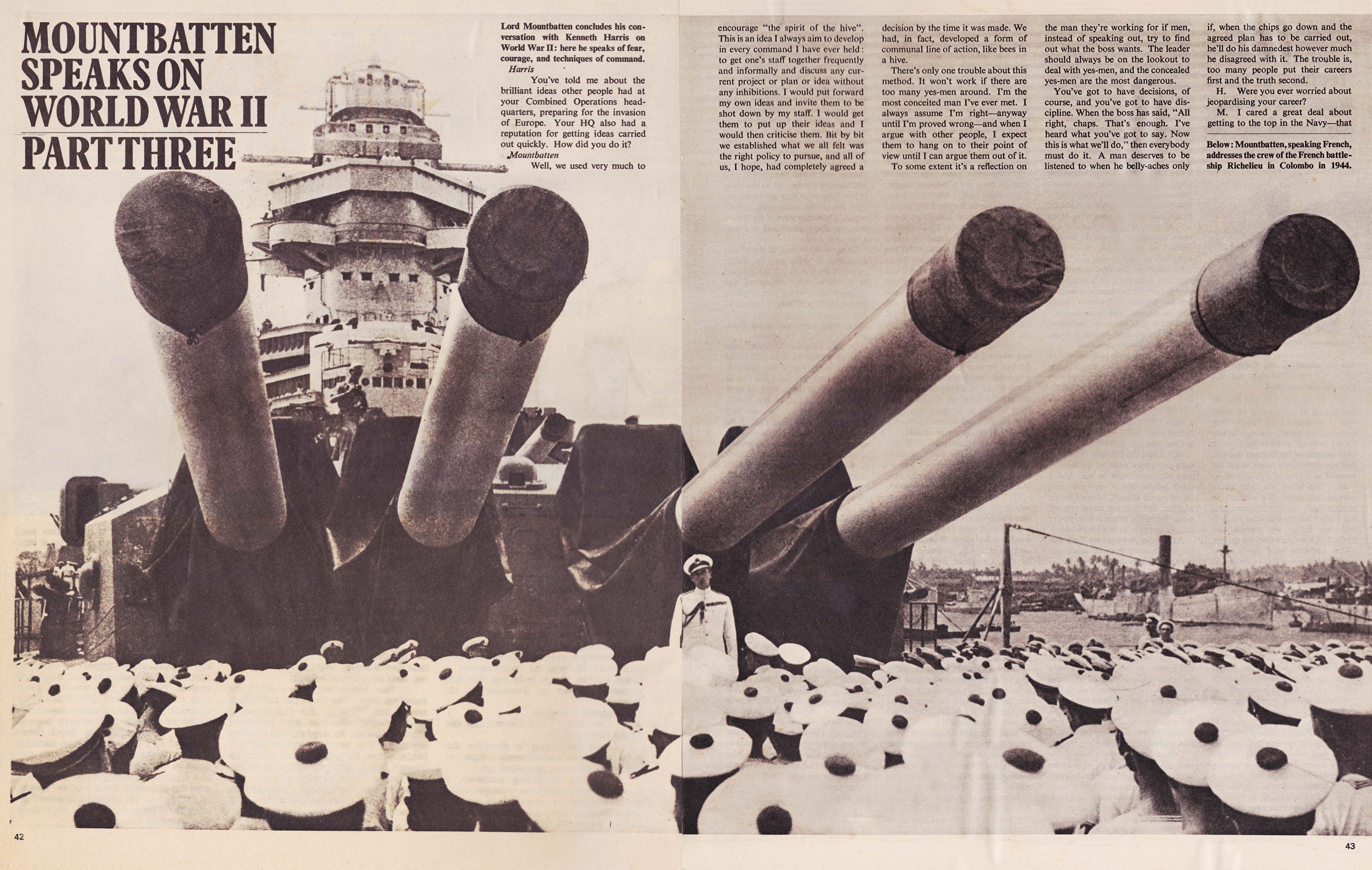
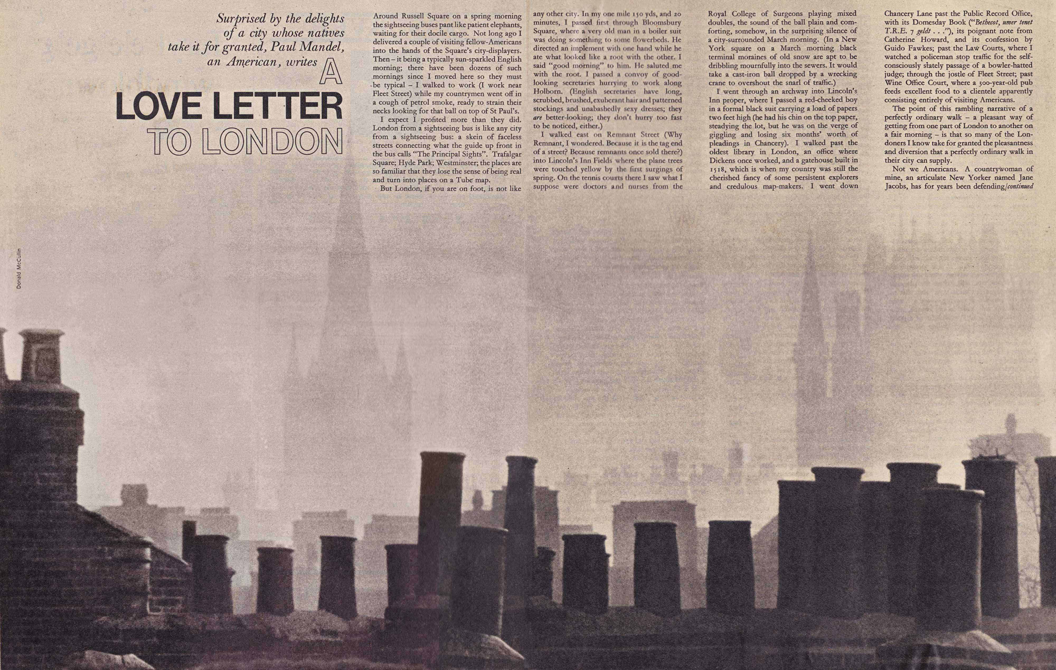
As one would expect from the man behind Penguin’s “Marber grid,” who Campbell describes as “mild-mannered, easy to get on with and open to ideas,” the magazine had a clearly defined form; he employed a flexible grid, confident sans serif display typography, and visual space, to create a vibrant and dynamic weekly supplement.
Each week Marber aimed to surprise, delight or inform readers with his covers, and from the very beginning he went for maximum effect. For the first issue, published on 6 September 1964, he selected a portrait of Louis Mountbatten by John Hedgecoe (the first colour image to be published by the newspaper) for the cover which he cropped boldly, stacking the cover lines tightly in the bottom left corner, forming an intense and confrontational cover that would not be out of place on today’s newsstands.
And one imagines that Marber was also quick to react to the cover potential in a colour portrait by The Observer’s long-serving photographer Jane Bown of a stately home owner for the 6 June 1965 issue where the chevron-like motif at the foot of the formal composition screams ‘place the cover line here’. The high contrast portrait of the actress Leslie Caron photographed in a coal yard in a simple white dress, by Iranian photographer Shahrokh Hatami (simply known as Hatami), and the simplicity of Hedgecoe’s portrait of Rita Tushingham with her large almond eyes making direct contact with the readers: both make for highly memorable covers. And what of the gentle humour of Marvin Lichter’s portrait of a young Jonathan Miller cross-eyed as he studies a reel of cinefilm?

In a feature on the black communities of Britain, titled ‘The Blacks’, a text by the exiled South African author Lewis Nkosi accompanies photographs by Magnum’s Ian Berry, who describes Marber as “one of the best art directors with whom I’ve worked.” Here Marber utilises changes in visual scale and juxtaposition for maximum impact in his use of Berry’s powerful black-and-white series. For the cover he takes a radical vertical slice through one image from the series, one of which was recently used as the cover for Bob Dylan’s Rough And Rowdy Ways album (released June 2020). No wider than a single column of his four column grid he confidently placed this narrow image on a red background with bold oversized typography to dramatic effect.
Berry, who was The Observer magazine’s first contract photographer, told me that before each story he would talk with Marber, “I would ask how big do you see this story being, how many pages,” with the pair then deciding how much time he should allocate to it, which would typically run into many weeks; and whether Berry should work in colour or black-and-white. He recalled, “Romek was always open to discussion about what was best for the story, and believed in hiring people for what they do, and not what he wanted them to do.”
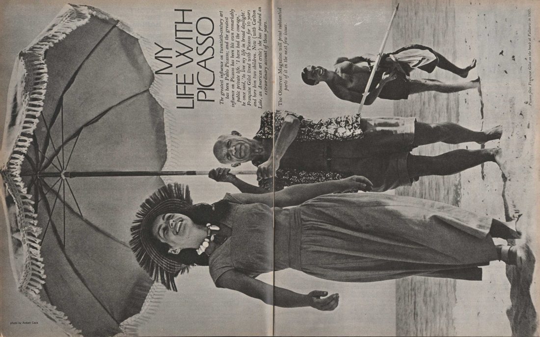
For the 15 November 1964 issue Marber breaks from convention in his use of Robert Capa’s 1948 photograph of the artist Pablo Picasso holding a parasol over his lover Francoise Gilot on the Côte d’Azur and rotates the vertically composed image so that it occupies an entire full-bleed spread. It was an approach he would use often, and one now frequently found within contemporary editorial design. In doing so he forces the reader to physically turn the magazine to fully engage with its content.
And for the cover Marber takes a paintbrush to Hungarian photographer Zoltán Glass’ black-and-white portrait of the Spanish artist. Vibrant flashes of red, blue and green pigment block out the background focusing the reader’s eye on the artist, creating a stimulating magazine cover that feels modern even today, six decades on, with the addition of a hand-lettered cover line above the artist’s head.
Marber had “an open eye for displaying stories well” says Berry, “which as a photographer you appreciate. It was never a question of him wanting to impose his choices on you, he always tried to include my preferred or favourite photographs into the story.” He continues, “and if I was in the office he would always come to me, and ask my opinion of the layouts he was working on.”
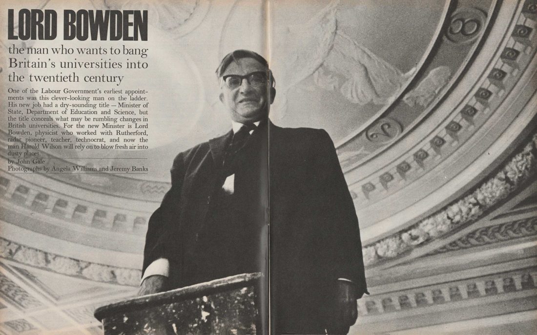
Marber’s natural affinity for a story allowed him to approach each anew. He gently sequences Brian Seed’s photoessay on a young boy with thalidomide facing the emotional and physical challenges of his first days at school, creating an upbeat and sensitive layout. And takes a more confrontational approach when laying out a story on the scientist and educationalist Lord Bowden. Here he runs Angela Williams’s and Jeremy Bank’s brooding and intense portrait across an entire spread, heightening the tension between page and reader.
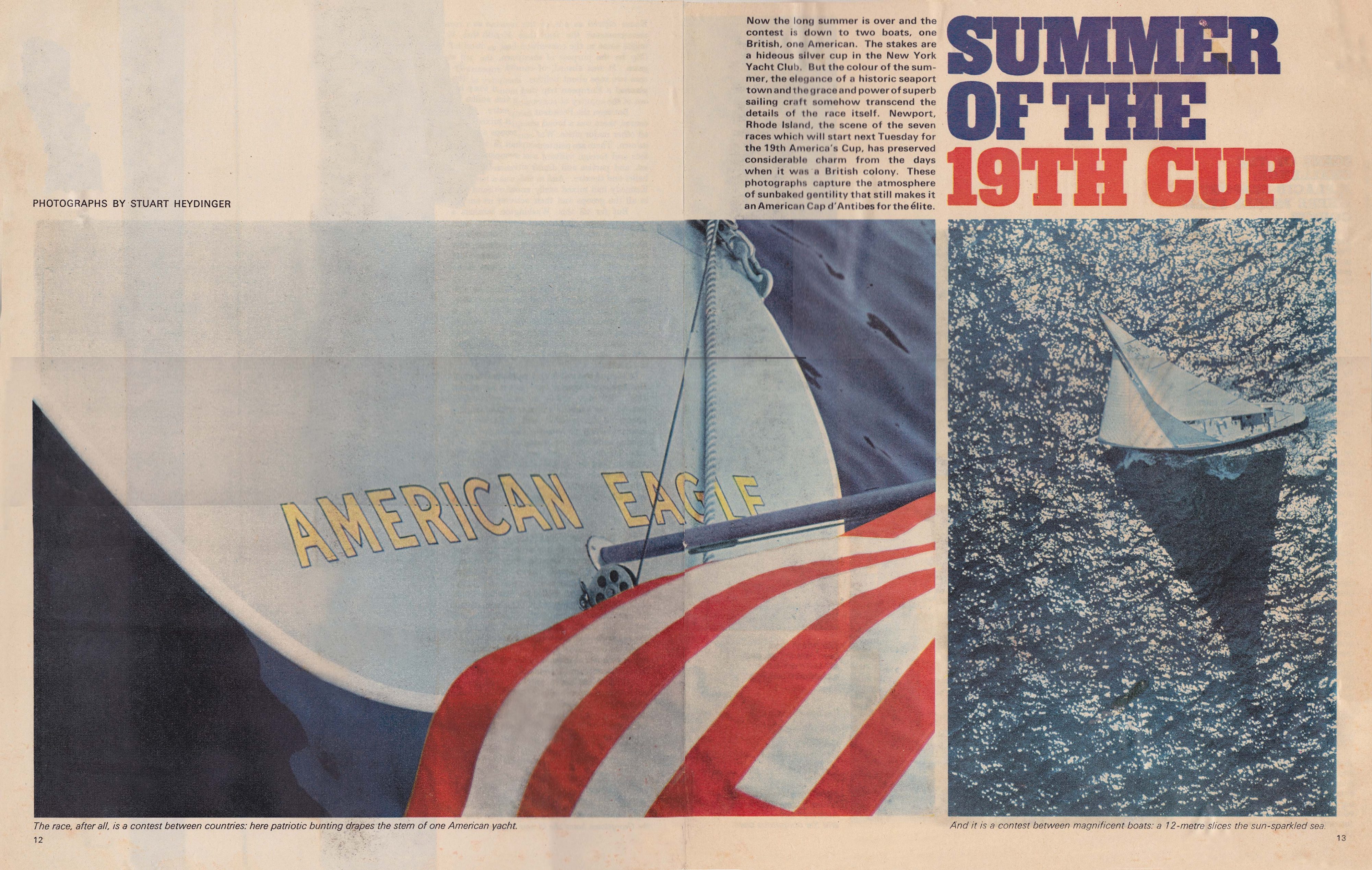
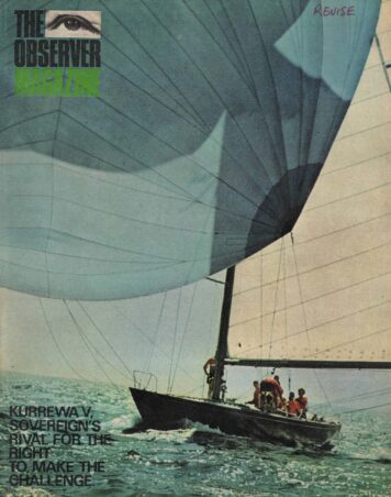
Whilst sans serif display typography was a key signature of Marber’s Observer magazine, it was not to the exclusion of other typestyles that he felt more appropriate to a story. He arranges colour images by The Observer’s chief photographer Stuart Heydinger below a slab serif headline in red and blue for a layout on the America’s Cup, which shouts U.S.A purely through its visual aesthetic. Silver-clad models photographed by Donald Silverstein dance across the fashion pages in another issue, and here Marber carefully crafts the fashion credits as a reaction to the models and the negative space their movement creates. Whilst the didone style headline feels elegant and restrained against the rhythmic images.

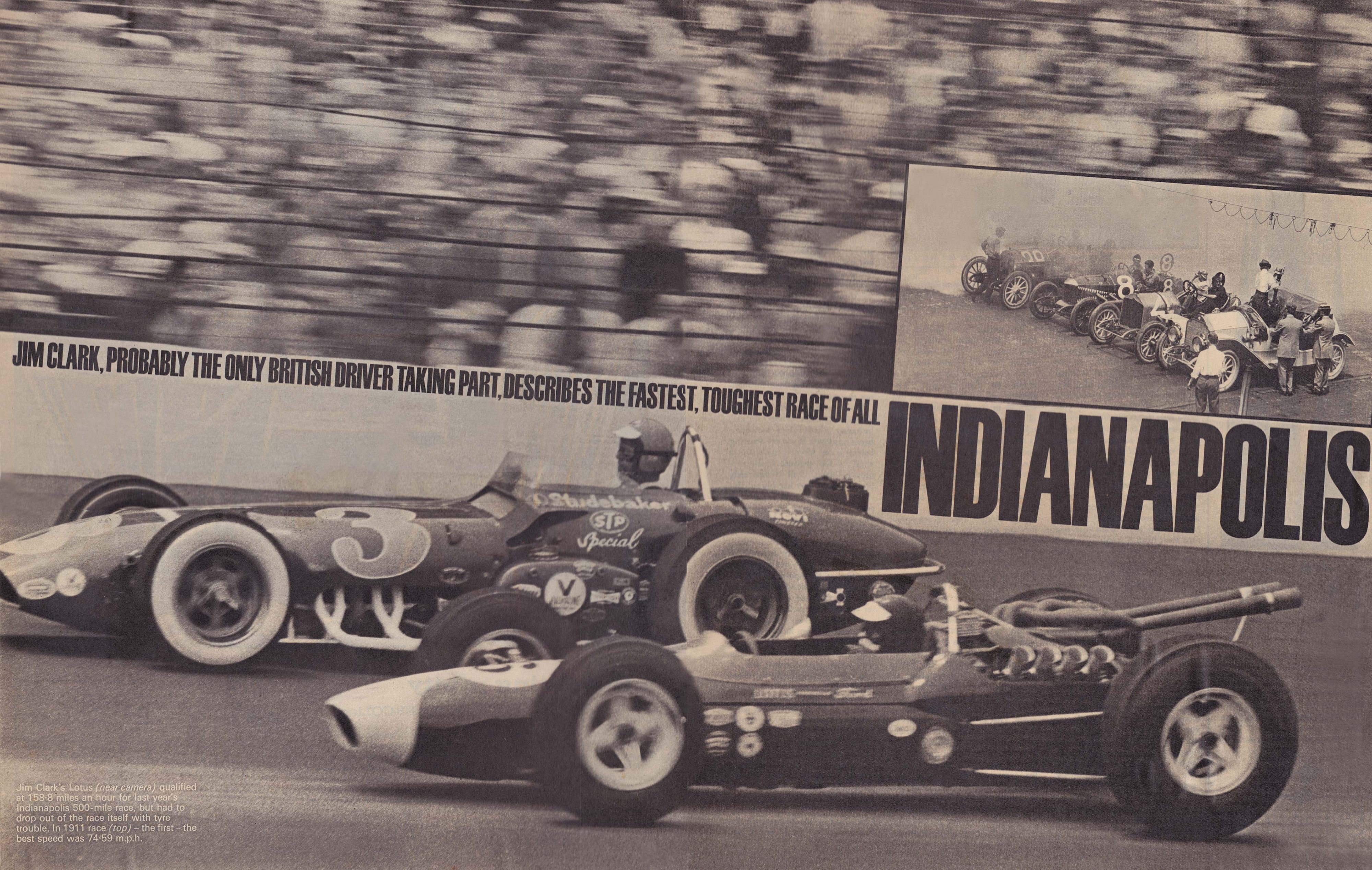
He occasionally broke from or angled his grid. On the opening spread to ‘1965 The Next Great Leap’, Marber deftly arcs the headline over a cutaway image of an Apollo command module, taking the reader’s eye on a rocket-like trajectory across the spread, whilst in a story on the Indianapolis raceway he integrates his bold advertising hoarding like typography within the void between spectators and race cars, its treatment increasing the sense of motion.

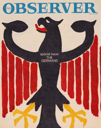
But Marber did not rely purely on photography alone; his use of illustration amongst the magazine’s pages and covers was equally as powerful and considered. For a special issue on Germany, he opted for minimal typography and painted a simple but highly effective rendering of the Bundesadler (‘Federal Eagle’, Germany’s state emblem, a black eagle on a yellow ground) to create a muscular cover. And another cover screams 1960s in its use of an illustration by the Oscar-winning animator Richard Williams.
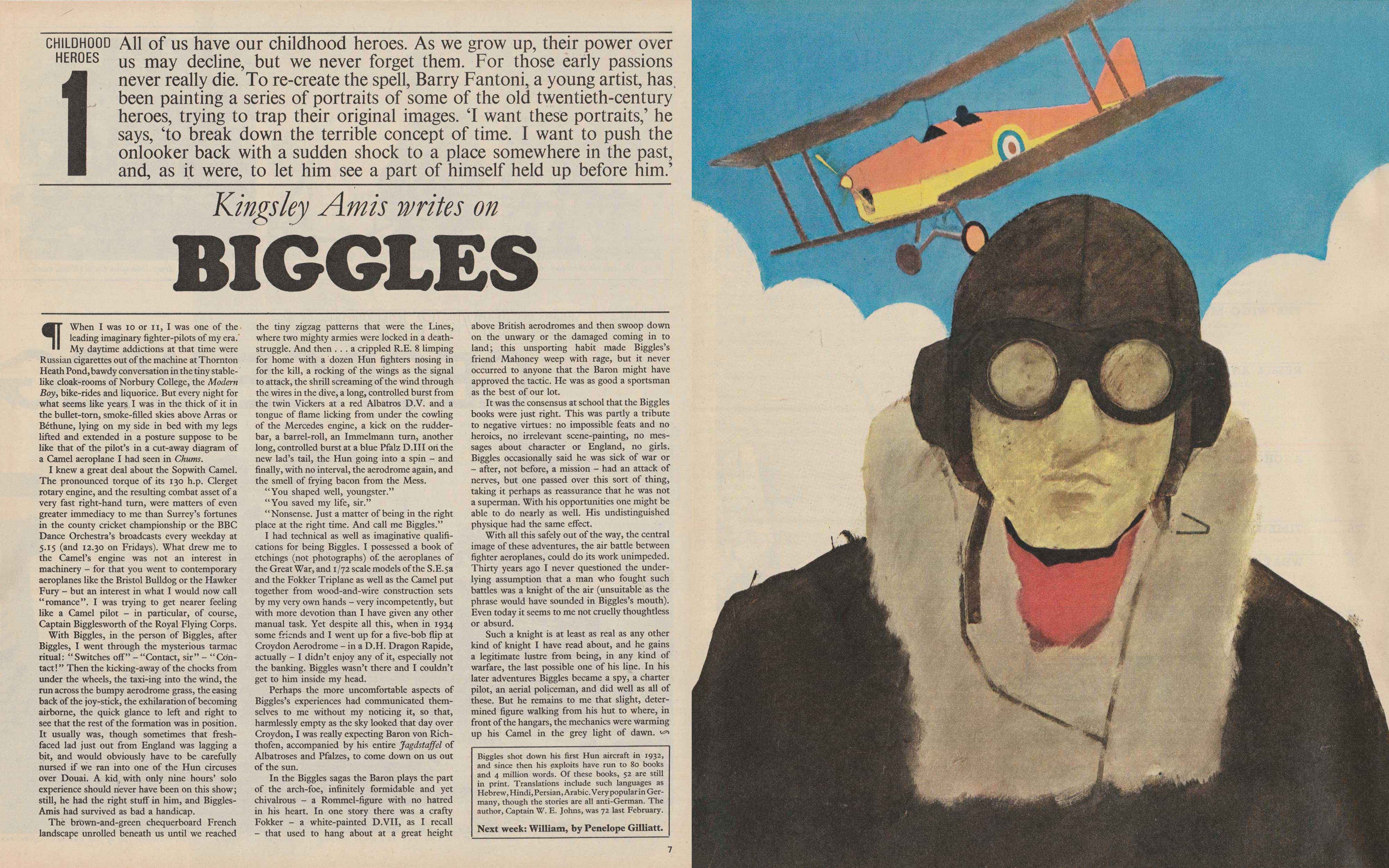
And he calls upon the multi-talented artist Barry Fantoni to produce weekly portraits of both real and fictional characters for a series called ‘Childhood Heroes’. Here he opts for a highly structured page layout, but Fantoni is able to bring a fresh and distinct look to these pages, week in week out.
“Romek’s Observer played an important part in the way British magazine design kept pace with the 60s revolution,’ says Fantoni, who considers him one of the top magazine designers of the post-war period. He continues, “he did not have the money The Sunday Times had to pay established contributors, so he looked to those who were coming up.”
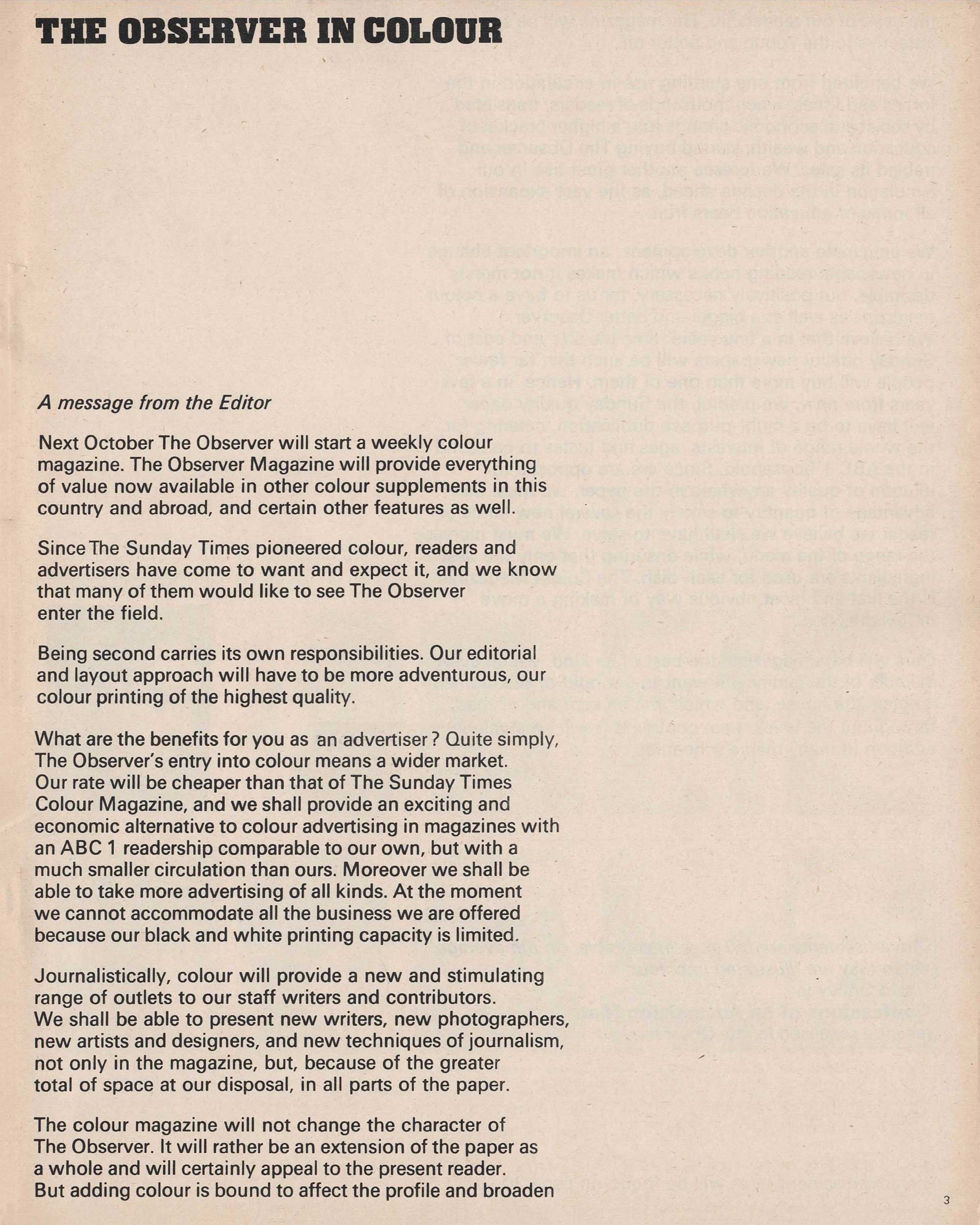
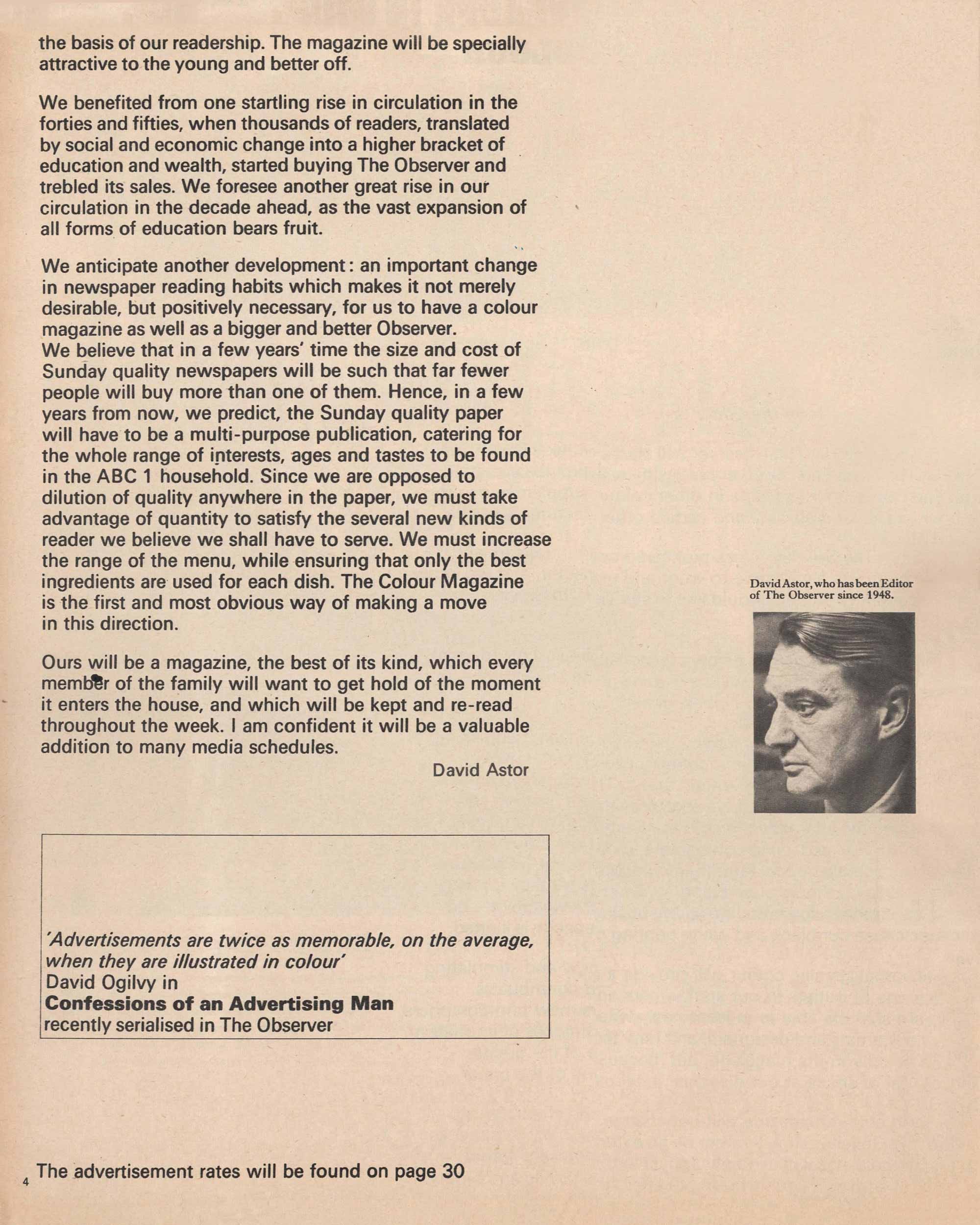
In a message to advertisers announcing the imminent launch of The Observer magazine, the newspaper’s editor David Astor wrote, “Being second (The Sunday Times Magazine was launched two years previously on 4 February 1962) carries its responsibilities. Our editorial and layout approach will have to be more adventurous …” However unlike The Economist, where Marber’s cover designs were never rejected, occasionally his designs for The Observer Magazine were considered too adventurous and “great covers were rejected” Fantoni told me. But that was all part of the editorial design process for Marber, who “just smiled and carried on.”

Whilst Marber’s work for Penguin, The Economist or New Society may be more familiar to many that is not to say his art direction of The Observer magazine is any less significant. On the contrary, he created a contemporary and stimulating magazine with a strong visual personality that was adventurous, just as Astor required, leaving a distinct signature on the history of editorial design.
Wayne Ford
Designer and Creative Director
Observer Colour Supplement Creative Director 1996-2002

The problems I encountered in printing! There were very good photographers but the printing was atrocious. Being commissioned by a magazine was one of the best forms of advertising for a photographer, so they were prepared to do the work for much less than they would charge a commercial company. Photographers would produce beautiful pictures but when they saw the transparencies in print they would refuse to do any more photographs.
When I came into conflict with Purnell’s they told The Observer management that the transparencies weren’t good enough. Eventually this annoyed me, I knew they couldn’t have been any better. One day I called a meeting at which the management of Purnell’s was present, the Editor of The Observer, and members of the technical management. Well, I thought, it’s very easy to prove that the printing Purnell’s do is terribly bad. The same advertisements that appear in The Observer also appeared in The Sunday Times. And if one placed them together it becomes obvious even to an amateur how inferior their final reproduction is. So I cut out those advertisements from The Sunday Times and I came to the meeting armed to prove that the problem lay with the printers, not the photographers. The people from Purnell’s immediately became speechless – when they saw the two adverts against each other they had no more excuses or arguments. I don’t think that my actions were seen in a very favourable light, even by the management of The Observer.
Romek Marber
In conversation with Orna Frommer-Dawson, July 2018

