Project Description
The Economist
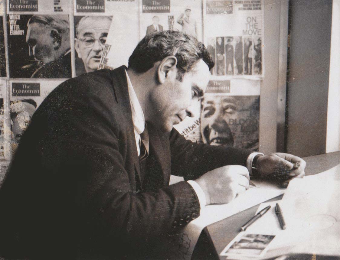
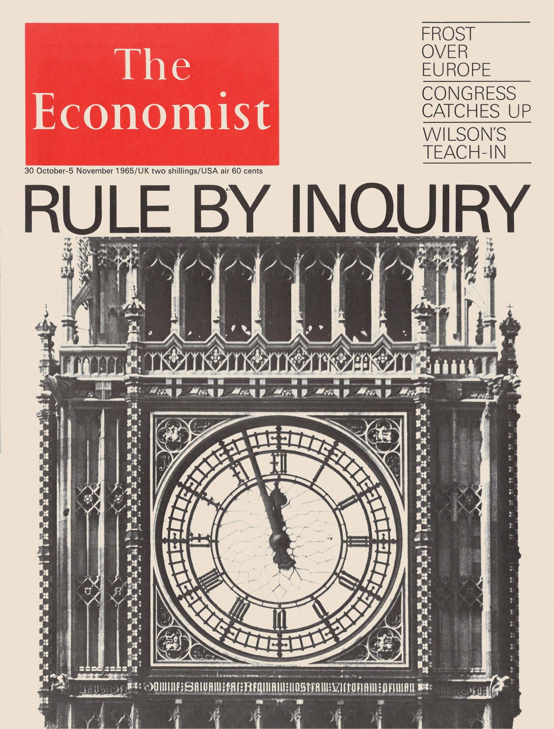
In their dynamism and menace, Romek Marber’s covers for The Economist in the early 1960s perfectly expressed the volatile politics of their era. And yet nobody else could have made them. His typeface swirls and marches across the page, conveying complex themes in immediate and arresting ways. Dollar and pound signs teeter on the words “ECONOMIC TIGHTROPE”. The term “ECONOMIC EXPANSION” repeats in a vertiginous circle. In what is probably the best-known example, JFK calls the Kremlin, the unanswered receiver looming in the foreground.
Compared with today’s, the tools at his disposal were simple—thin paper and, for much of the time, only two colours, red and black. But the palette fitted his stark, ominous imagery. It still grabs your attention and makes you want to know more. His covers are remembered as some of the most inspired and effective that the magazine has ever produced. Both as a teacher and role model he continues to influence The Economist’s design.
A.D. Miller
Culture editor
The Economist
Bruce Brown writes in ‘Romek Marber Graphics’: In 1960 Peter Dunbar, commissioned Marber to design covers for The Economist magazine. Up to this point The Economist covers had been comprised of text but no images. The cheap newsprint paper, coarse letterpress halftones and two-colour printing (in red and black) gave Marber’s bold images an immediacy that had physical presence and visual force. Read more

Romek designed a cover for an article about industrial strikes in Britain using an old French engraving of a crowd. He replaced a Tricolour held aloft by a woman with a Union Jack, but inadvertently flipped the flag. Peter Dunbar desperately telephoned Romek on the Monday following publication. Romek recalled: “he said there are sackfuls of mail about the cover, all saying how does a magazine like The Economist make a mistake like this? They thought to blame the mistake on a ‘foreigner designer,’ but ultimately the publisher should have checked. Among the letters was one from an Admiral, congratulating The Economist that ‘there are still people around who know that a Union Jack upside down means disaster’. This saved the day!”. Sadly, we do not have a copy of this cover – let us know if you have an example.


